COVID and Air Pollution in Mexico
We can use rsinaica to find out what happened to air pollutions levels in several Mexican cities after people started taking social distancing measures due to the novel coronavirus
First, we load the packages necessary for the analysis
## Auto-install required R packages
packs <- c("dplyr", "ggplot2", "gghighlight", "lubridate", "anomalize",
           "aire.zmvm", "tidyr", "zoo", "plotly", "rsinaica", "ggseas")
success <- suppressWarnings(sapply(packs, require, character.only = TRUE))
if (length(names(success)[!success])) {
  install.packages(names(success)[!success])
  sapply(names(success)[!success], require, character.only = TRUE)
}
Download PM10 data
Then we download the data for the whole 2020 and 2019 using the sinaica_param_data function. Since the maximum data range we can download is 1 month, we have to use a little mapply magic to download the entire year.
# Download all PM10 pollution data in 2017
pm10_2020 <- bind_rows(
  mapply(sinaica_param_data,
         "PM10",
         seq(as.Date("2020-01-01"), as.Date("2020-06-01"), by = "month"),
         seq(as.Date("2020-02-01"), as.Date("2020-07-01"), by = "month") - 1,
         remove_extremes = FALSE,
         SIMPLIFY = FALSE)
)
pm10_2019 <- bind_rows(
  mapply(sinaica_param_data,
         "PM10",
         seq(as.Date("2019-01-01"), as.Date("2019-06-01"), by = "month"),
         seq(as.Date("2019-02-01"), as.Date("2019-07-01"), by = "month") - 1,
         remove_extremes = FALSE,
         SIMPLIFY = FALSE)
)
This is what the data looks like:
| id | station_id | station_name | station_code | network_name | network_code | network_id | date | hour | parameter | value_original | flag_original | valid_original | value_actual | valid_actual | date_validated | validation_level | unit | value |
|---|---|---|---|---|---|---|---|---|---|---|---|---|---|---|---|---|---|---|
| 101PM1020010100 | 101 | Atemajac | ATM | Guadalajara | GDL | 63 | 2020-01-01 | 0 | PM10 | 58.326 | 128 | 1 | 58.326 | 1 | NA | 0 | µg/m³ | 58.326 |
| 101PM1020010101 | 101 | Atemajac | ATM | Guadalajara | GDL | 63 | 2020-01-01 | 1 | PM10 | 104.09 | 128 | 1 | 104.09 | 1 | NA | 0 | µg/m³ | 104.090 |
| 101PM1020010102 | 101 | Atemajac | ATM | Guadalajara | GDL | 63 | 2020-01-01 | 2 | PM10 | 101.73 | 128 | 1 | 101.73 | 1 | NA | 0 | µg/m³ | 101.730 |
| 101PM1020010103 | 101 | Atemajac | ATM | Guadalajara | GDL | 63 | 2020-01-01 | 3 | PM10 | 90.637 | 128 | 1 | 90.637 | 1 | NA | 0 | µg/m³ | 90.637 |
| 101PM1020010104 | 101 | Atemajac | ATM | Guadalajara | GDL | 63 | 2020-01-01 | 4 | PM10 | 82.158 | 128 | 1 | 82.158 | 1 | NA | 0 | µg/m³ | 82.158 |
| 101PM1020010105 | 101 | Atemajac | ATM | Guadalajara | GDL | 63 | 2020-01-01 | 5 | PM10 | 95.17 | 128 | 1 | 95.17 | 1 | NA | 0 | µg/m³ | 95.170 |
The data is hourly, but we can average it to the daily levels and filter it to only include major cities. Obviously a more formal analysis would make sure that no new stations were added during the periods we are comparing and would filter the measurement errors that are sometimes returned by the sensors.
# Only include stations that reported for more than 80% of days
df_filtered <- bind_rows(pm10_2019, pm10_2020) %>%
  filter(!is.na(value)) %>%
  add_count(station_id, network_name)%>%
  filter(!(value > .0955 & hour %in% c(0:11, 21:23))) %>%
  filter(value < 300) %>%
  filter(n > 180*.8)  %>%
  select(-n)

df_ave <- df_filtered %>%
  group_by(date, network_name) %>%
  summarise(ave = mean(value, na.rm = TRUE), .groups = 'drop') %>%
  add_count(network_name) %>%
  arrange(network_name) %>%
  mutate(year = year(date)) %>%
  mutate(doy = yday(date)) %>%
  filter(network_name %in% c("Valle de México", "Monterrey", "Toluca",
                             "Guadalajara", "Pachuca", "Puebla"))
ggplot(df_ave, aes(doy, ave, group = year, color = as.factor(year))) +
  geom_line(size = .1, alpha = .7) +
  scale_color_brewer("year", type='qual', palette = "Set1") +
  facet_wrap(~ network_name, ncol = 3) +
  ggtitle(expression(paste("Average daily ", PM[10], " concentration and 30 day moving average, by network (2019 and 2020)"))) +
  labs(subtitle = "Community mobility in Mexico started dropping around March 15 (day 74 highlighted by a vertical black line)") +
  xlab("day of year") +
  ylab(expression(paste(PM[10], " ", mu,"g/", m^3))) +
  theme_bw() +
  stat_rollapplyr(width = 30, align = "right") +
  geom_vline(xintercept = 74) + #March 15 is day number 74
  theme(axis.text.x=element_text(angle=60,hjust=1))
## Warning: Removed 58 row(s) containing missing values (geom_path).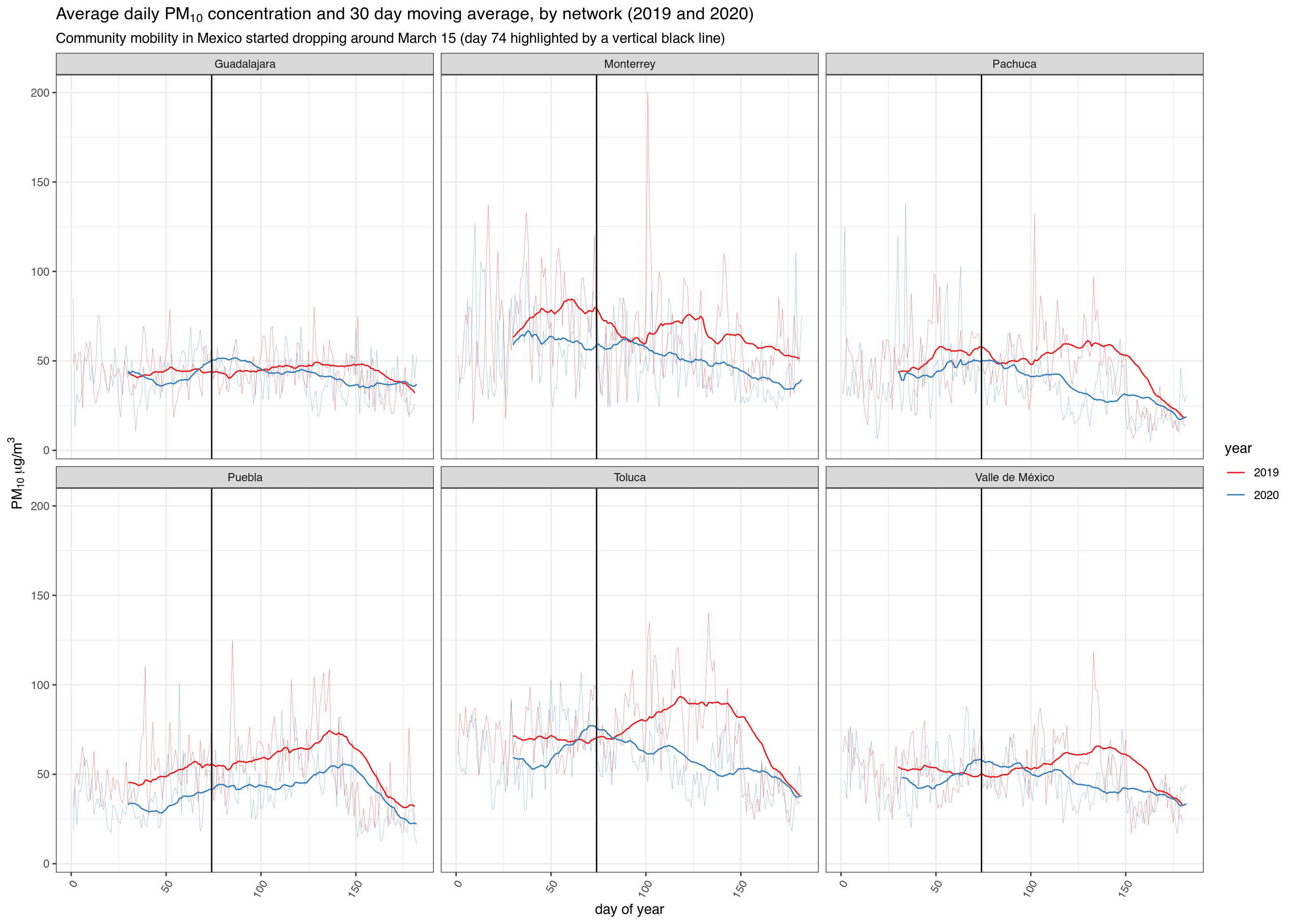
PM2.5
# Download all PM10 pollution data in 2017
pm25_2020 <- bind_rows(
  mapply(sinaica_param_data,
         "PM2.5",
         seq(as.Date("2020-01-01"), as.Date("2020-06-01"), by = "month"),
         seq(as.Date("2020-02-01"), as.Date("2020-07-01"), by = "month") - 1,
         remove_extremes = FALSE,
         SIMPLIFY = FALSE)
)
pm25_2019 <- bind_rows(
  mapply(sinaica_param_data,
         "PM2.5",
         seq(as.Date("2019-01-01"), as.Date("2019-06-01"), by = "month"),
         seq(as.Date("2019-02-01"), as.Date("2019-07-01"), by = "month") - 1,
         remove_extremes = FALSE,
         SIMPLIFY = FALSE)
)
# Only include stations that reported for more than 80% of days
df_filtered <- bind_rows(pm25_2019, pm25_2020) %>%
  filter(!is.na(value)) %>%
  add_count(station_id, network_name)%>%
  filter(!(value > .0955 & hour %in% c(0:11, 21:23))) %>%
  filter(n > 180*.8)  %>%
  select(-n)

df_ave <- df_filtered %>%
  group_by(date, network_name) %>%
  summarise(ave = mean(value, na.rm = TRUE), .groups = 'drop') %>%
  add_count(network_name) %>%
  arrange(network_name) %>%
  mutate(year = year(date)) %>%
  mutate(doy = yday(date)) %>%
  filter(network_name %in% c("Valle de México", "Monterrey", "Toluca",
                             "Guadalajara", "Pachuca", "Puebla"))
ggplot(df_ave, aes(doy, ave, group = year, color = as.factor(year))) +
  geom_line(size = .1, alpha = .7) +
  scale_color_brewer("year", type='qual', palette = "Set1") +
  facet_wrap(~ network_name, ncol = 3) +
  ggtitle(expression(paste("Average daily ", PM[2.5], " concentration and 30 day moving average, by network (2019 and 2020)"))) +
  labs(subtitle = "Community mobility in Mexico started dropping around March 15 (day 74 highlighted by a vertical black line)") +
  xlab("day of year") +
  ylab(expression(paste("daily maximum 24 average of ", PM[2.5],
                        " (", mu,"g/", m^3, ")"))) +
  theme_bw() +
  stat_rollapplyr(width = 30, align = "right") +
  geom_vline(xintercept = 74) + #March 15 is day number 74
  theme(axis.text.x=element_text(angle=60,hjust=1))
## Warning: Removed 58 row(s) containing missing values (geom_path).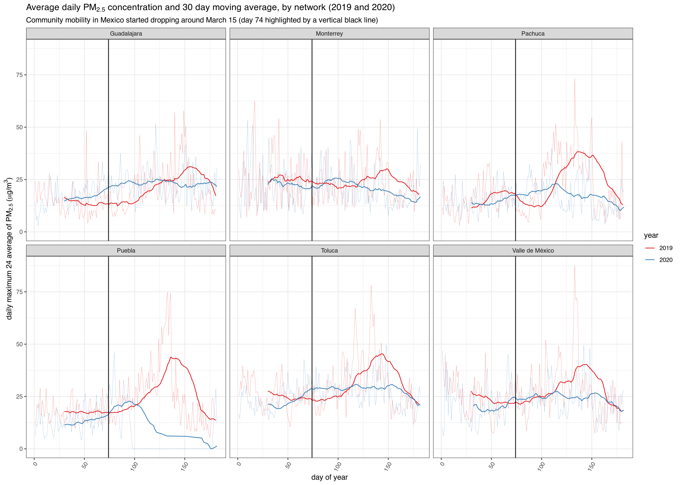
O3
# Download all PM10 pollution data in 2017
o3_2020 <- bind_rows(
  mapply(sinaica_param_data,
         "O3",
         seq(as.Date("2020-01-01"), as.Date("2020-06-01"), by = "month"),
         seq(as.Date("2020-02-01"), as.Date("2020-07-01"), by = "month") - 1,
         remove_extremes = FALSE,
         SIMPLIFY = FALSE)
)
o3_2019 <- bind_rows(
  mapply(sinaica_param_data,
         "O3",
         seq(as.Date("2019-01-01"), as.Date("2019-06-01"), by = "month"),
         seq(as.Date("2019-02-01"), as.Date("2019-07-01"), by = "month") - 1,
         remove_extremes = FALSE,
         SIMPLIFY = FALSE)
)
# Only include stations that reported for more than 80% of days
df_filtered <- bind_rows(o3_2019, o3_2020) %>%
  filter(!is.na(value)) %>%
  add_count(station_id, network_name)%>%
  filter(!(value > .0955 & hour %in% c(0:11, 21:23))) %>%
  filter(value < .3) %>%
  filter(n > 180*.8)  %>%
  select(-n)

df_ave <- df_filtered %>%
  group_by(date, network_name) %>%
  summarise(ave = mean(value, na.rm = TRUE), .groups = 'drop') %>%
  add_count(network_name) %>%
  arrange(network_name) %>%
  mutate(year = year(date)) %>%
  mutate(doy = yday(date)) %>%
  filter(network_name %in% c("Valle de México", "Monterrey", "Toluca",
                             "Guadalajara", "Pachuca", "Puebla"))
ggplot(df_ave, aes(doy, ave, group = year, color = as.factor(year))) +
  geom_line(size = .1, alpha = .7) +
  scale_color_brewer("year", type='qual', palette = "Set1") +
  facet_wrap(~ network_name, ncol = 3) +
  ggtitle("Average daily ozone concentration and 30 day moving average, by network (2019 and 2020)") +
  labs(subtitle = "Community mobility in Mexico started dropping around March 15 (day 74 highlighted by a vertical black line)") +
  xlab("day of year") +
  ylab(expression(paste(O[3], " ppm"))) +
  theme_bw() +
  stat_rollapplyr(width = 30, align = "right") +
  geom_vline(xintercept = 74) + #March 15 is day number 74
  theme(axis.text.x=element_text(angle=60,hjust=1))
## Warning: Removed 58 row(s) containing missing values (geom_path).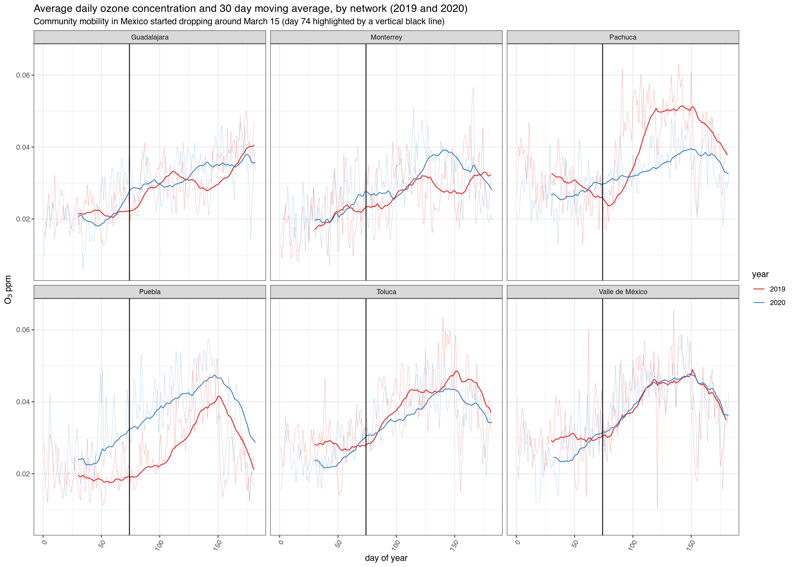
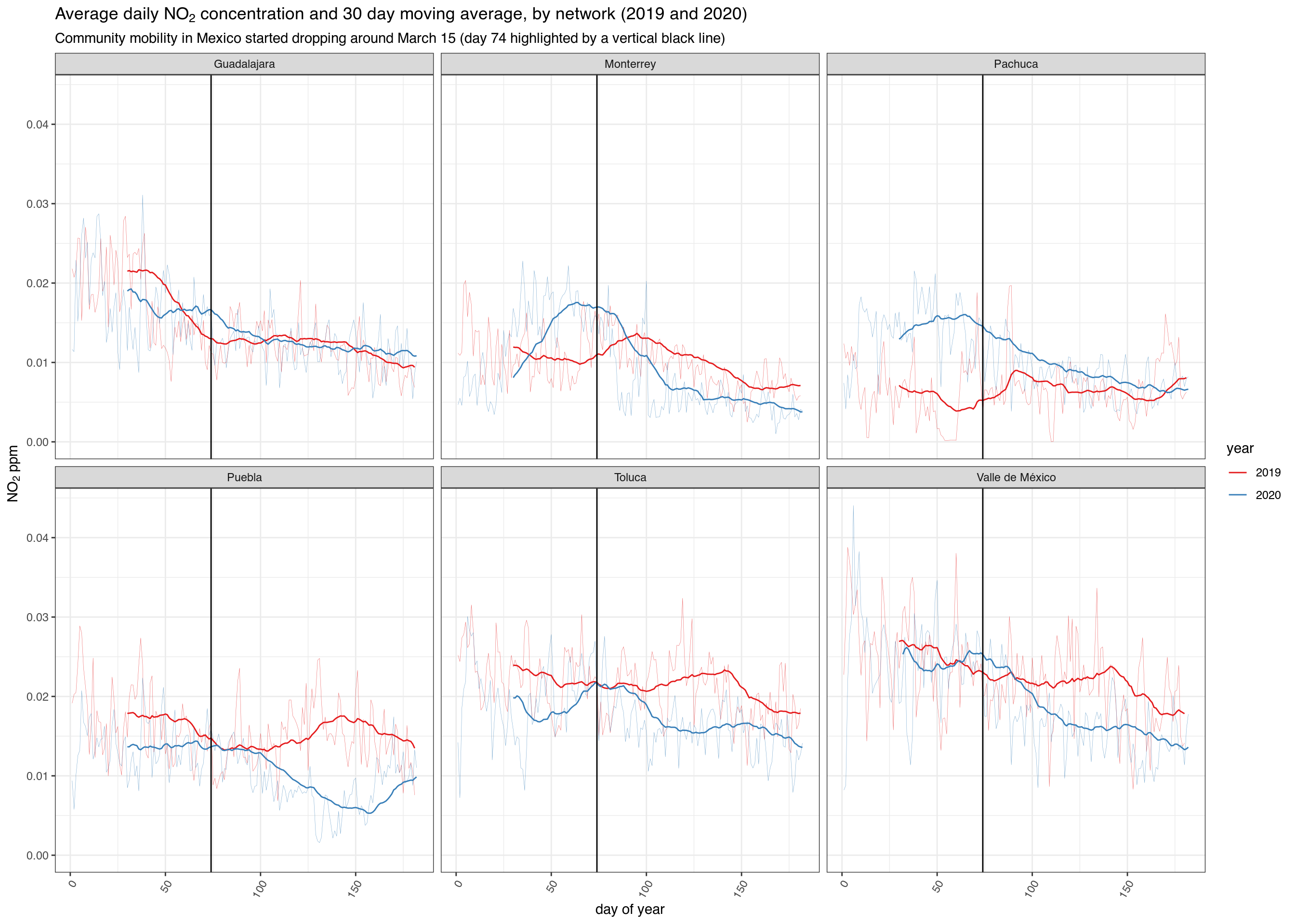
NO2
# Download all PM10 pollution data in 2017
no2_2020 <- bind_rows(
  mapply(sinaica_param_data,
         "NO2",
         seq(as.Date("2020-01-01"), as.Date("2020-06-01"), by = "month"),
         seq(as.Date("2020-02-01"), as.Date("2020-07-01"), by = "month") - 1,
         remove_extremes = FALSE,
         SIMPLIFY = FALSE)
)
no2_2019 <- bind_rows(
  mapply(sinaica_param_data,
         "NO2",
         seq(as.Date("2019-01-01"), as.Date("2019-06-01"), by = "month"),
         seq(as.Date("2019-02-01"), as.Date("2019-07-01"), by = "month") - 1,
         remove_extremes = FALSE,
         SIMPLIFY = FALSE)
)
# Only include stations that reported for more than 80% of days
df_filtered <- bind_rows(no2_2019, no2_2020) %>%
  filter(!is.na(value)) %>%
  add_count(station_id, network_name)%>%
  filter(!(value > .0955 & hour %in% c(0:11, 21:23))) %>%
  filter(value < .3) %>%
  filter(n > 180*.8)  %>%
  select(-n)

df_ave <- df_filtered %>%
  group_by(date, network_name) %>%
  summarise(ave = mean(value, na.rm = TRUE), .groups = 'drop') %>%
  add_count(network_name) %>%
  arrange(network_name) %>%
  mutate(year = year(date)) %>%
  mutate(doy = yday(date)) %>%
  filter(network_name %in% c("Valle de México", "Monterrey", "Toluca",
                             "Guadalajara", "Pachuca", "Puebla"))
ggplot(df_ave, aes(doy, ave, group = year, color = as.factor(year))) +
  geom_line(size = .1, alpha = .7) +
  scale_color_brewer("year", type='qual', palette = "Set1") +
  facet_wrap(~ network_name, ncol = 3) +
  ggtitle(expression(paste("Average daily ", NO[2], " concentration and 30 day moving average, by network (2019 and 2020)"))) +
  labs(subtitle = "Community mobility in Mexico started dropping around March 15 (day 74 highlighted by a vertical black line)") +
  xlab("day of year") +
  ylab(expression(paste(NO[2], " ppm"))) +
  theme_bw() +
  stat_rollapplyr(width = 30, align = "right") +
  geom_vline(xintercept = 74) + #March 15 is day number 74
  theme(axis.text.x=element_text(angle=60,hjust=1))
## Warning: Removed 58 row(s) containing missing values (geom_path).